Concept Piece
Animation created by Alexander Bass who specialises in animation. He is going on to do a BA (Hons) Animation at the University of Creative Arts at Farnham. He was inspired by the work of Tim Burton, Edward Gorey and Dave McKeane and it is clear to see this dark tone in this animation. The work is focused on the idea of "Fear and Phobias" which fits with the tone of the people that inspired him. I selected this because it presents an educational element in a stylised manner which fits the concepts being described. The use of only black and white creates the dark feel of the topic perfectly and the slightly jumpy animation creates a nervous and scary atmosphere.
Form Piece
Series of paintings done by Andrew Orkney who specialises in fine art. He is going on to do Earth Sciences at Oxford University. He has been inspired by many things, including "The Selfish Gene" by Richard Dawkins, Edward Leer, fossil hunting and talking to experts in Cardiff Museum of Art. The work is focused on creatures and in Andrew's words "making the viewer feel like they are looking into an alien world." The aesthetic of his work is incredibly appealing to look at and it does feel like you are looking into an alien world, with animals with strange, vibrant colours. The backgrounds he has created on his pieces create a mystical atmosphere to each one, adding an extra level of depth to each piece.

Tuesday, 2 July 2013
Wednesday, 26 June 2013
Barney Bubbles Artist Research
Barney Bubbles was born Colin Fulcher on the 30th July 1942 and died on the 14th November 1983 aged only 41. Throughout his career he worked as a graphic designer and worked predominantly in the music industry designing record sleeves for British artists. Alongside this he painted privately, created furniture designs and also worked on magazines such as NME. His work often features symbolism and riddles and is a defining feature of his work.
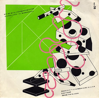
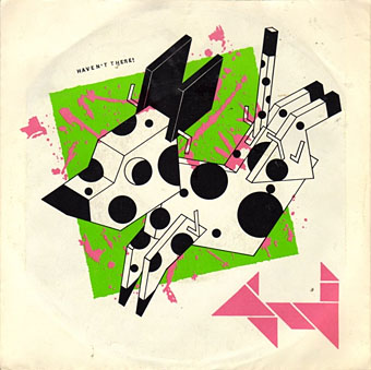

These two pieces are among the best album covers Bubbles created in his life. The first is titled "Hit me with your Rhythm Stick" and was created for Ian Dury and the Blockheads in 1978, and the second is called "In Search of Space" and was made for the band Hawkwind in 1971. These two album covers clearly show Bubbles' versatility of his style, creating very different themes for the two covers. "In Search of Space" has a compelling visual element created through the use of surreal colours and images. This tone encapsulates the band's science fiction image
and is clearly representative of the band. The emblem design involving the eagle and stars creates an iconic feel, incorporating American patriotic elements.
Wednesday, 1 May 2013
Packaging Research


The design agency behind this packaging is Romanian based Ampro Design with art and illustrations by Alin Patru. The packaging design was released in March 2013 and is for the chocolate brand Spria.
The artists have used watercolour paints to create lifelike floral imagery incorporating additional artwork to depict the flavour of each bar, for example honey and nuts. Additional detail such as butterflies and bees help the package maintain its natural feel. This style they use creates a very attractive and feminine quality, appealing to their female target audience. The pale background colour of the package allows the artwork and lettering to stand out clearly on the shelf against its competition, which is very important in such a saturated market.
 The Spria logo has been designed to resemble liquid chocolate, allowing the lettering to flow and curve in an elegant manner. In addition, a crown has been included in the logo to emphasise the luxurious nature of the product. The overall package design definitely stands out and is unique among its competitors. Its target audience is clearly defined with a strong feel of quality being portrayed.
Thursday, 25 April 2013
Lindt and Cadbury Chocolate

Both Cadbury and Lindt are popular producers of chocolate for different target markets. First of all the logo of each company clearly defines the audience for their products. The Cadbury logo features a bright purple background with simple rounded lettering, creating an appealing and eye catching design, aiming at the younger market. On the other hand, the Lindt logo includes sophisticated and elegant gold lettering, creating an up market product aimed at the older age group.
Much of the packaging of Cadbury products incorporates bright colours and simplistic, bubble lettering to encourage young children and teenagers to purchase their products. Packaging of Lindt products is of a far higher quality than Cadbury. Lindt products are normally boxed or cardboard wrapped instead of foil wrapped, giving them the feel of a luxury item. The boxes usually are a deep red colour with decorative patterns, once again producing an up market feel.
The words used on the Lindt packaging also supports the high quality of the product. Phrases such as "taste of excellence" and "master Swiss chocolatier" explain to the buyer the quality that they will be experiencing. The theme of luxury is highlighted with these key phrases which help distinguish Lindt chocolate as a high quality product. With Cadbury's products there is very little writing other than the name of the chocolate bar. This allows the full attention of the buyer to focus on the big bold lettering and bright colours of the wrapping.
Both Lindt and Cadbury are very successful at targeting their respective target audiences with appropriate packaging and logo designs. Cadbury's products are clearly for a younger audience and their whole brand clearly shows this. Lindt is targeted more for people wanting a higher quality of chocolate and everything about their brand shows the luxurious side to eating chocolate.


Thursday, 18 April 2013
Tim Marrs Artist Research
Tim Marrs is a graphic designer and illustrator who is known for his visually striking work which encompasses lots of different techniques. These techniques include drawings, photography, screen printing, photoshop work and more. During his career Marrs has worked with many famous clients including Pepsi, Nike, Maxim, Saatchi and Saatchi and Virgin, just to name a few.

Marrs' work has a very bold and dynamic look, with a mix of influences from American pop culture, pulp fiction and pop art. All of his work has careful thought regarding colour, composition and style to create the perfect blend of these elements.The images in his work are very surreal and he uses colour in a very bold and strong way to bring these images to life. Marrs incorporates a wide range of subjects in his work, drawing inspiration from everyday images such as famous buildings, road signs and nature, presented in an abstract and original manner.

This is a piece Marrs created to promote the fast food chain Taco Bell. The poster encapsulates lots of elements associated with Los Angeles, the location of the company's headquarters, including the sun, beaches, skateboarding and the Route 66 sign. The reds, oranges and yellows used give the feeling of warmth which relates to both the climate and the spicy tacos themselves. This colour scheme also helps the poster to clearly stand out from the background and is very appealing to look at. The iconic images and themes used give the poster a very familiar feel to it. People recognise the famous Hollywood and Route 66 signs, the fun of surfing and skateboarding in summer and going to rock concerts. These ideas perfectly fit into the strap line "Taste of Youth" as well as the phrase "taste of excitement" featured in the bottom right corner of the poster. The poster's style is consistent with a lot of Marrs' other work, featuring bold composition, vibrant colours and clever imagery. Marrs' poster perfectly fits the exciting and fun theme Taco Bell would have wanted from him, portraying a lifestyle everybody would want to lead.

New Blog!
This is my new graphic design blog. I will be posting any graphics I find interesting or inspiring as well as some of my own work. I am especially interested in photo montage and typographic work and here is a piece I created during my last topic:


Subscribe to:
Comments (Atom)